


Free Mini Lesson: Tableau Heat Grids
In this months free Tableau Academy mini lesson I show you how to create a 'heat grid' in Tableau which enables users to easily and visually compare any two results to each other in any data set

Each month we bring you a free mini lesson from Tableau Academy, these lessons are much shorter than our normal lessons and give you a flavour of some of the things that you learn as a full member.
Did you know, the value of each Tableau Academy lesson is at least £150 which means Tableau Academy subscribers are receiving two brand new lessons every month worth over £300 for just £19! 🤯
The full Tableau Academy lessons cover a full project from start to finish with step by step instructions, useful tips and insight and demonstration videos. If you want to get the most out of Tableau Academy simply hit the button below to get full access:

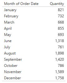
For August’s free mini lesson we’re going to look at how you can a table of results, like the one below, and enable users to quickly compare any of the results in it with any other result:
To do this we’re going to utilise a heat grid that looks like the image at the top and makes it easy for anyone to scan down a column and across a row and see the variance between those two results.
In the example we’re going to walk through we’ll compare the volume of sales from one month to any other to see how it’s changed. We’ll use the sales store example data for this, you can download that and the final workbook below:
(Note: Comparing monthly results is actually pretty poor practice as months have varying numbers of days so shouldn’t be compared like for like, in retail a month with more weekends will typically have greater sales too. In reality you’d create an average per day to counteract the differing number of days, or use a 4 week period but for our example we’ll keep it simple!)
Creating the data
(Note: The data we’ll use is simply a sum of the Quantity or Orders for each month in 2020 from the Sales superstore. You could create this yourself, or for ease you can download the aggregated data below instead).
Our first step is to create the data we need for this, initially it may look like we can do this in Tableau with just the data file we have but what we actually need is two copies of the data linked together as below:
Open up the data you want to use, highlight all of the data including the headers and copy it and paste it into Tableau (Simply hit Ctrl + v on an empty sheet and it will add a new data connection with the data, you’ll see why we’re doing it this way in a minute).
Right click the newly created data source that appears in Tableau and click ‘Edit Data Source’
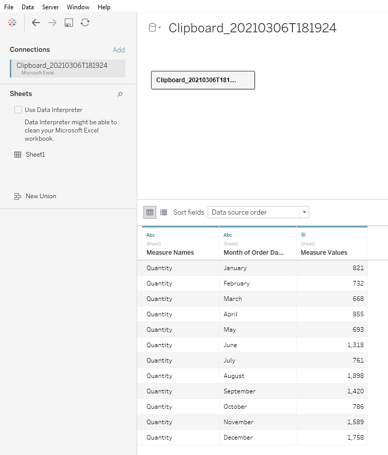
On the data source pane that has appeared click in the window and press ctrl + v again and another copy of your data will appear, the Edit Relationship box should also appear where we can link our two data sets together.
Click “Create join calculation” under your data table on the left and enter any value (we just put a 1 in). Do the same on the right as well, it doesn’t matter what you put in the calculation as long as it’s the exact same on both sides.
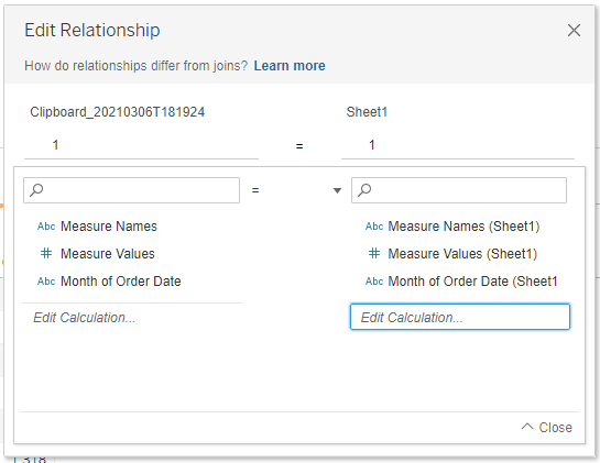
Close the Edit Relationships window. The next couple of steps are optional but make it easier later on
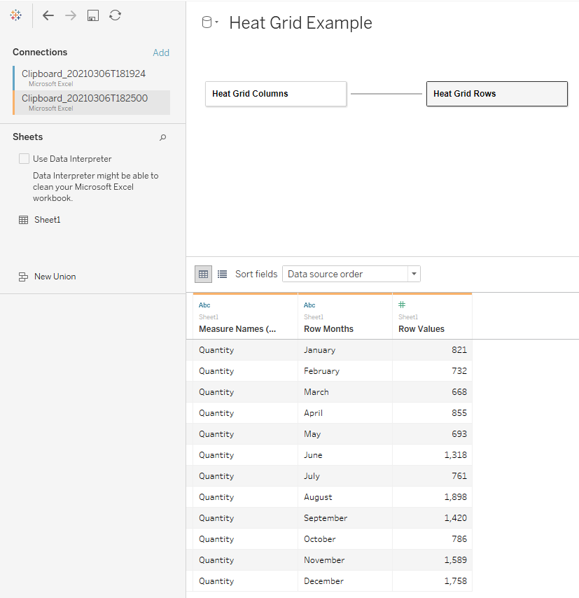
Click your first data source, then click on the arrow to bring up the drop down menu and click rename and call it ‘Heat Grid Columns’
Right Click your dates column (Month of Order Dates in our example) and rename this to Column Months.
Right Click your values (Measure Values in our example) and rename this to Column Values.
Repeat the last 3 steps for your second data source, but use Rows in place of Columns. It should look like this:
Create the view
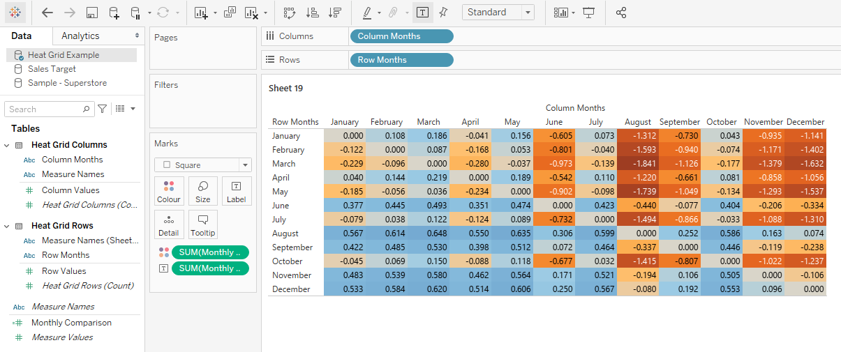
Now we have the data we need with a value for each month combination that we can plot onto the rows and columns of a sheet as follows:
Create a new sheet, from your Heat Grid Example data drag Column Months onto the Columns and Row Months onto the Rows. (Pro tip: Double click Row Months and then Column Months to automatically add them to the view)
Create a new calculated field (Pro Tip: Press Alt then a then c to quickly create a new calculated field), name it Monthly Comparison, for the calculation divide the row values by the column values (remembering to subtract it from 1 so it’s a relative percentage change) as below then press OK.
1 - ([Column Values]/[Row Values])Double click the Monthly Comparison measure you just created to add it to your view, it should look something like this:

Drag Monthly Comparison from your measures onto Colour.
Click the Marks drop down box and click Square. It should now look like this and pretty much gives us what we need, in the next steps we’ll clean this up and make it easier to read.
Finishing steps
While the above gives us what we need there are a few things we can do to make this look nicer and be easier to read.
Format the numbers
As we’re looking at a relative comparison let’s make these percentages:
Click Monthly Comparison in your measures, hover over Default Properties and click Default Number Format.
Select Percentage and make it 0 decimal places.
Format the layout
I personally prefer a border around the values the cells to be more square and the numbers to be centred as I think this gives a cleaner look.
Click Colour and set the border colour to be white.
Click Label and then the Alignment drop down menu.
Click the Centre option Under both Vertical and Horizontal alignment .
Hover over any of the month titles on the Rows until you see the size arrow, drag the arrow down until it lines up with the bottom of the next row in order to double the size of your rows. This is how it should now look:

Add Tooltips
I’d like to be able to see a bit more info about the actual values and how they changed, to avoid cluttering my view I do this in my tooltip.
Drag both Row Values and Column Value to tooltip. You could leave it like this but you could also customise your tooltip as below.
Click Tooltip and then edit what you would like to show. I like to show my tooltip as a commentary so edited mine to show like this.

You may even want to add another calculation that shows the actual change in values between the two months. I left this out as it wasn’t required.
Remove The Same Month Comparisons
Notice the diagonal line down the middle that’s all 0%? That’s where we’re comparing the same month, let’s hide that since it doesn’t make sense to include it.
Right click on your Monthly Comparison calculated field and change the calculation to this (this is going to give us null when it’s comparing the same months:
IF [Column Months] != [Row Months] THEN 1- [Column Values]/[Row Values] ENDDrag your Monthly Comparison onto filters and make sure include nulls is not selected.
Final Touches
There’s a couple of final things I like to do to finish this off as well:
Change the colour: I’m not a fan of the blue and rusty orange colour scheme, blue and red works well for this but be mindful of accessibility and in particular colour blindness.
Remove headers: The headers that say Row Months and Column Months don’t add anything to our chart so let’s hide them by right clicking on each and selecting Hide Field Labels…
Format borders: I like the outside borders of my grid to be the same as my inside borders. Select Format > Borders (or press ctrl o, b), under both row and column divider set the Pane to the lightest grey and the Header to None.
That’s it, we’re all done! The result should look something like this:
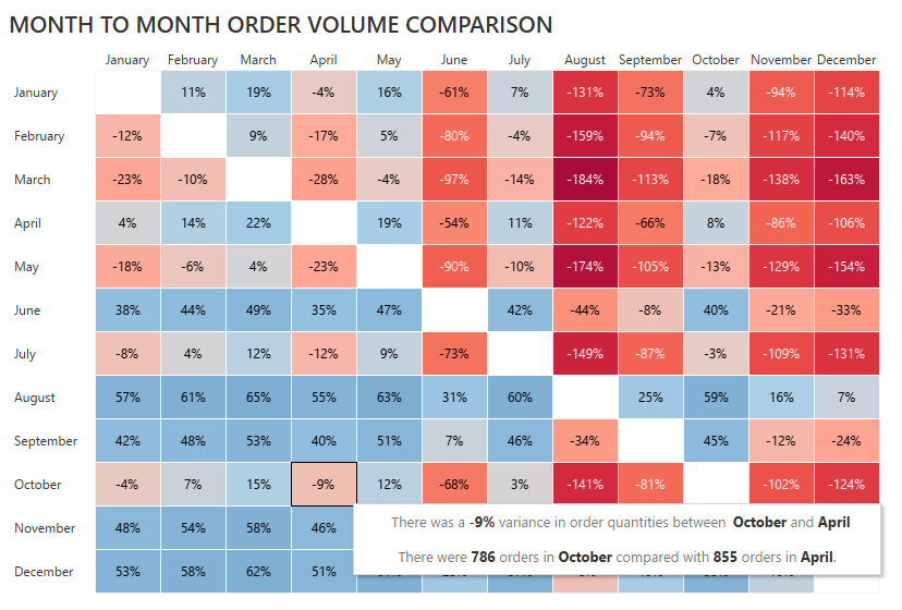
We can now look down any column and then along the row to see how the sales varied between any two months. Hovering over the result gives us the individual order quantities for those months and the variance.
What next?
Want to take this to the next level? Why not try some of the following:
Add a parameter that lets uses flick between relative and absolute variance.
Add a parameter that lets users choose whether to compare the sales values, profit, discount or order quantities
Incorporate it into a dashboard that when you click a box shows you the per day or per week sales for just the selected months.
Did you know, the value of each Tableau Academy lesson is at least £150 which means Tableau Academy subscribers are receiving two brand new lessons every month worth over £300 for just £19! 🤯
Here’s what some recent full Tableau Academy lessons have looked at:

Thanks,
Alan @ Tableau Academy