


🏢📍 Lesson 6 FREE PREVIEW: Building an interactive floorplan and room/desk finder
In the latest of my Tableau Academy projects I share a project around building an interactive floorplan to help people find available workspaces and meeting rooms and provide directions on a map.

Hey There! 👋
The latest Tableau Academy project has just been published and shared with our brilliant Tableau Academy members, here I give you a quick preview of the latest project and what you’ll be building.
Did you know the value of each Tableau Academy lesson is at least £150? Tableau Academy subscribers receive two brand new lessons every month worth over £300 for just £19! 🤯🤯🤯
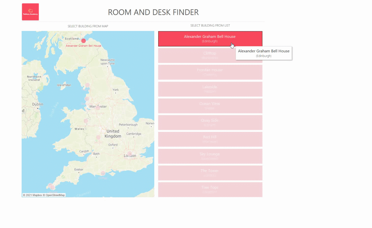
With the rise in remote and agile working there’s a greater demand than ever for flexible work spaces, this project shows you how to build a solution that allows users to find available work spaces and meeting rooms within a building, review information about the work spaces such as air quality, noise levels, energy consumption and temperature to select a suitable workspace.
Users can even seen animated directions direct to their selected work space and find out which desks and rooms are free, which are booked and where their colleagues are currently working from.
Here’s what the end solution looks like 👇
And here’s a quick preview video too 👇
The lesson is available for current Tableau Academy Subscribers right here 👇


Some of my favourite parts of this weeks project include:
✅ Adding background images to a dashboard/chart
Learn how to use images as backgrounds and how to create the data you need to plot points and information onto an image, map or background.
✅ Smarter dynamic measures
We’ve previously covered how you can let users switch between the metrics or data shown on a chart, but in this lesson we show you how to overcome some of the limitations with doing this including:
Showing the correct number format for the metric the user chooses when they have differing formats. E.g. What if one metric is a percentage to two decimal places such as 19.08% and another shows noise levels as a whole number such as 55 dB, how do you display this correctly?
Dealing with colour ranges when for one metric a higher number is better and the other a lower number is better? How can you prevent confusing users by having one colour indicating good sometimes and indicating bad at other times?
✅ Displaying room booking availability
Learn how to let users set a specified time and see if a room/resource is available at that time and use a tooltip in viz to show booking info on a gantt chart.
✅ Using Tableau to show dynamic directions on a map
Learn how to let users select a location and see directions to it on a map/floorplan and even animate the path to their chosen destination!
🙌 Plus enjoy a special bonus video on us showing you how to use custom shapes and creating heatmaps in Tableau!
If you’re not already subscribed to Tableau Academy simply hit the button below to sign up and get instant access to this plus all previous projects and a brand new one delivered to your inbox every two weeks!
Here’s what some of the recent projects have covered (the next one will be released on Tuesday 24th August)
👉 Project 5 - Creating a mobile first dashboard (27th July)
👉 Project 4 - Exploring sales data to generate insight (13th July)
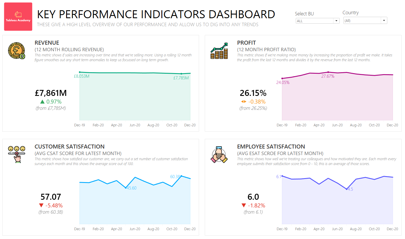
👉 Project 3 - Creating a KPI dashboard (29th June)
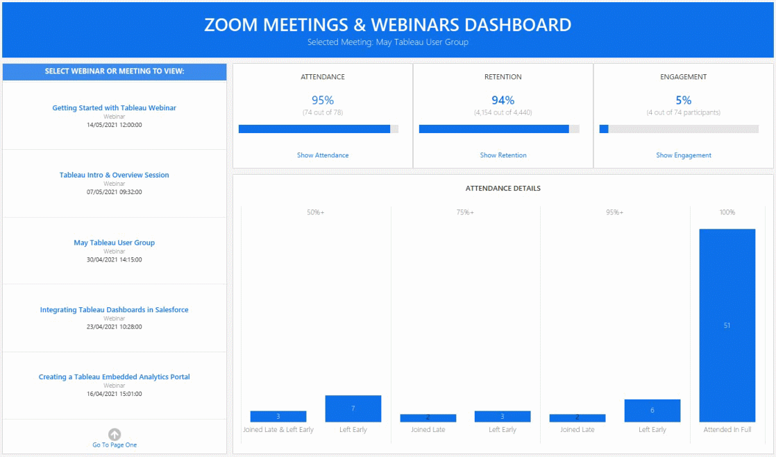
👉 Project 2 - Creating a zoom webinars dashboard (14th June)
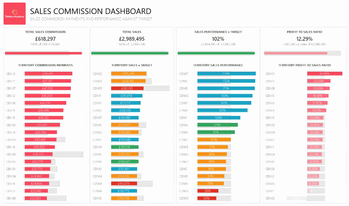
👉 Project 1 - Creating a sales commission dashboard (1st June)
👉 Free Sample Project - Creating a mobile first dashboard
Don’t miss out on the next fantastic Tableau Academy lesson, just hit the button below to sign up now!
Thanks, Alan @ Tableau Academy